


A few years ago I wrote on what middle sets tend to be, and, visually, the ten-guild plane splits its introduction into two sets, with the third being the conflict or resolution. We saw this with Dragon's Maze and will see it again soon in War of the Spark. Only the original Ravnica block broke that mold as they separated the guilds into a 4/3/3 combination instead of a 5/5/10 or 5/5/? combination we are yet to see. By having this oversized plane issue, while you see more of the plane, the story trudges slowly because you can't progress the narrative. Instead, you have to spend 4-6 months on the same snail-like pace. Wizards found a clever solution to this, as I explained in How Have the Guilds Changed? It might be a good primer for this review, if you have a few minutes to catch up how the visual identity of each guild has shifted over time.
Ravnica Allegiance is much the same as Guilds of Ravnica: establishing the guilds as they are now and which side of the Bolas conflict they're on. To reinforce this, I asked the creative team at Wizards, and one member had this to say:
"Since we created the sets in tandem re: themes, season, etc, they are supposed to feel cohesive between each other artistically. There's not much more to share than "different guilds, progression of the story."
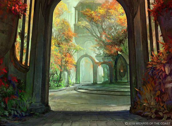
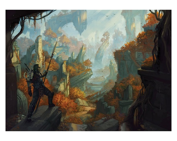
All right then. This means that autumn is on Ravnica, and here two beautiful examples from John Thacker and Tyler Walpole:
Let's see what is different in the set at large or in greater context to other middle sets, keeping in mind that Wizards went away from middle sets for the last year or two.
There was an Uptick in Traditional Art, right?
If you're curious why Matt Stewart had six paintings, look to Donny here to see that the amount of traditional paintings remained roughly the same.
Traditional #mtgart #MTGGRN: 40
— Donny Caltrider @ The Mirror Gallery (@YoungAntiqueman) February 3, 2019
Traditional #mtgart #MTGRNA: 43
I could be off +/- a few for traditional works from digital artists and vice-versa, but it's close.
In Guilds of Ravnica, only Russian artist Alexander Deruchenko's Expansion // Explosion had traditional media, whereas in Allegiance, Warrant // Warden was made by Matt Stewart as the same example. They're both around 15% traditional work, but what changed?
The Guild Kits + Mythic Edition
By having more art released around the same time as a new set, it feels as though there are considerably more paintings, though it's only a slight bit more. The traditional art market was flooded with paintings because it was right after the holiday season, meaning people weren't contacting artists as much via email or private message to purchase the original painting before auction. Normally we don't see the paintings as much. Timing has much to do with it.
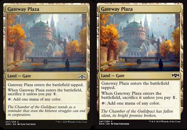
As a fun sidenote, of the 268 unique card artworks, only one was reprinted, Gateway Plaza, shown below. It was given new flavor text, a great addition to advance the storyline while still supplementing the set. I personally would've loved a slight variation: removing leaves on the trees and removing the human figures to show the change in mood, though it isn't needed.
This set feels old, like 1990s art!
I have heard this sentiment often in the past few weeks. I'll explain why people are stating this by using Jason's wonderful piece below.
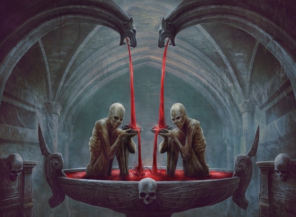
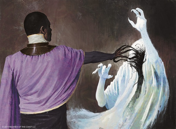
Notice the art description clearly asking for two malnourished/zombie characters seated in a bowl with two spouts into it. The location/setting could've been a church or a catacomb, changing a Golgari scene to an Orzhov scene. You assume Orzhov, but the lack of windows means catacomb, which could be under a church or an underground church.
It is open-ended and that is what makes the card artwork feel like something you saw in the 1990s because all of those art descriptions were more open-ended by nature. (I love sketch 2, but that's me just agreeing with Jenn Ravenna.)
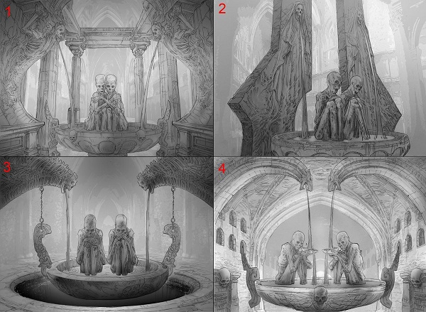
Black often has the most open-ended art descriptions because the thing is the focus and where it is often becomes secondary, allowing folks like Kev Walker to make a misty background and that's plenty ok. Allegiance handled this well.
Great Art Description Writing / Artist Additions
I want to shoot off a bunch of lightning round commentary on really well executed art descriptions, with artists fully embracing the concept.
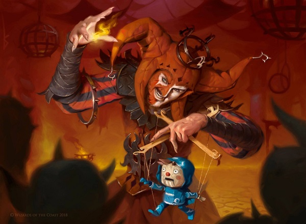
Make a jester with a Jace marionette.
Victor: Goes way beyond what is necessary, then two miles past that point:
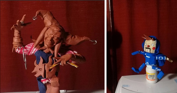
Artists create maquettes to study lighting on figures. Victor creates them from time to time like his previous (angel). Making a fully realized Jace creation surprised everyone, becoming the Fblthp fan favorite of the entire set. Great work Victor.
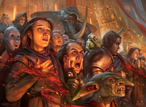
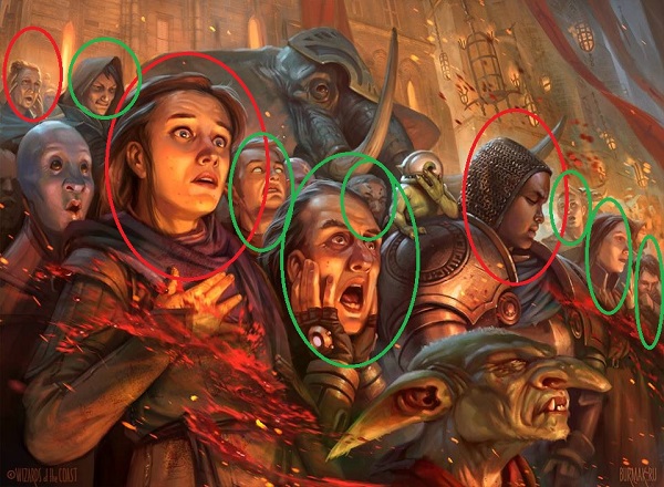
In other cases, simply painting a crowd watching a Rakdos presentation was enough of an art description to show the guild's change of being in pits and crowded rooms to entertaining on the streets. A smart flip of the camera by the creative team to ask for this. Add in Dmitry's reaction faces, and you have a fresh perspective to show who attends these gruesome (fun?) performances.
I've spoken about art descriptions of spells always needing to be one of three options. They're either before the action, as it is happening, or the after effect.
Clearly the descriptions with "as it is happening" can be mixed, like in Ethereal Absolution that shows something Kaya and Teysa already did, but it is still happening, just like Ill-Gotten Inheritance. It gives it both a dynamic composition with some sturdy character elements who aren't moving. It creates an interesting card art from the art description stage.

Speaking of Ill-Gotten Inheritance, that little Asian boy surrounding by coins leads me to my next point in Ravnica Allegiance.
Is the Set Diverse?
I like to ask this question because it's not in art like Kaya's depictions that I am looking for here. She is in some sets and as a marquee planeswalker, she will show up from time to time. I'm looking for a diverse everything, beyond skin color.
To check the fastest examples, look at crowds for trading card games. If you don't see a few different ages or races of characters, it's not a crowd, it's a Wii baseball outfield of same. I went back to Dmitry's crowd and found ten humans, seven white, two women of whom one is an older woman, and a black character. By no means is this a perfect way to check, but it's a good indicator that art directors at Wizards are noticing this and counting faces.
I looked into the small groups of characters in Ravnica Allegiance, and again, from Aaron Miller and Jason Rainville to Ben Wootten's art, artists are being mindful of adding a mix of older, younger, black and white characters to their card art.

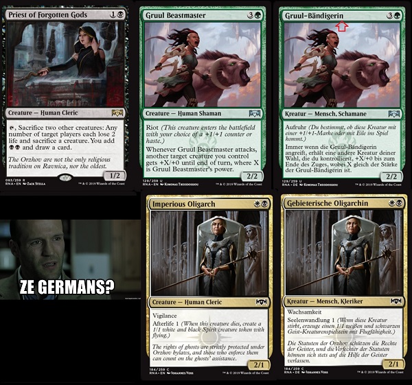
Also you don't want to overlook the addition of having a priest, beastmaster, or oligarch be women. Normally in card games, a master or leader or something is default coded as male. Even as shown, the English version below of Priest of Forgotten Gods should be priestess, though they kept it priest. This is notable as a movement to call women who act actors and not actresses. It has a weight to it. This is a minor point noticed by the naming/flavor text teams working in coordination with the art directors.
We can see from the Germans that gender is not to be confused, as the -in ending is meant to read as female and the language has gendered nouns. The default of white male is prevalent in the gaming industry but it appears the statements aren't just lip service in Magic at all. They really are pushing for diverse characters.
Sure, some 15-year white boy might make a homemade firework to shoot off outside. But who will try to test a pressure cooker, pushing every electrical circuit in the house at the same time during the holidays? That will always be your cool grandma. Again, Dmitry Burmak absolutely brought that feel to Ravnica Allegiance:
I also noticed characters like an enforcer, effectively an assassin, be a woman.
Likewise, a grizzled veteran doesn't need to mean white five o' clock shadow on a male. When its a woman that doesn't look that old, veteran takes on new meaning. Are all veterans young? Or did Volkan paint an adult woman without wrinkles, meaning she could be a veteran at age 32, like many military veterans are these days after a few tours of duty.
This is notable because it adds layers of meaning. This is a socially conscious addition, but it also adds narrative depth to the game, which at default the industry doesn't comment on. It takes additional effort.
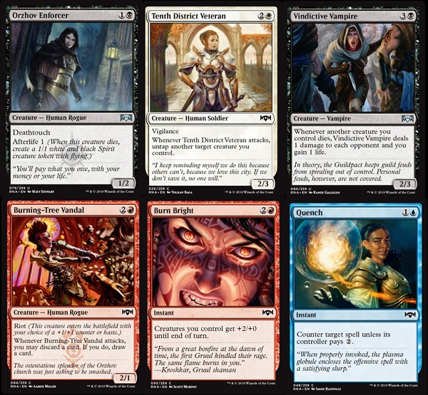
Add in the eyebrow shift and slight upturn in her smile, and Quench is more than just another counter. It's a big mood and a white guy couldn't add that layer of depth as easily.
My eye also caught more women in non human cards.
These characters could be anything. When Magali, Kate, and Jesper chose though, they chose women. It's so subtle, and none of these cards are Constructed playable. People may miss this inclusion and I feel it's very important to point it out.
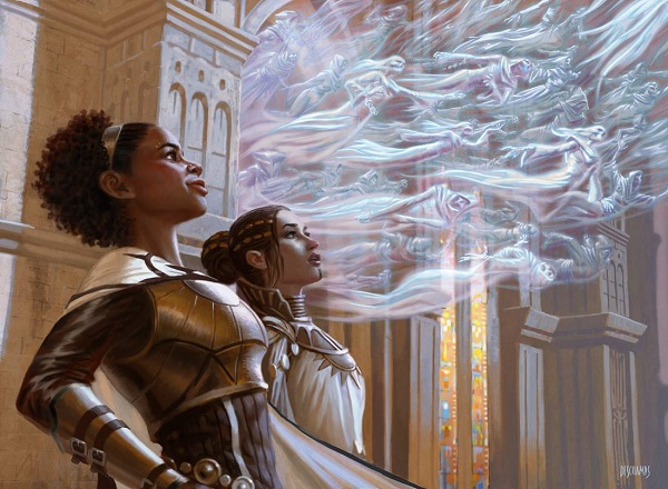
The plane, as a reminder, is comparable to Sigil, the city of doors and the center location for the Planescape setting in Dungeons and Dragons. We should see all manner of people here. Wheelchairs have precedents but we haven't quite seem them outside one planeswalker. It was nice to see a stark contrast of color in Consecrate by Igor Kieryluk.
Consecrate by Igor Kieryluk
Digital
Colorism is a topic Magic hasn't quite been able to integrate into art descriptions yet. It's difficult to ask for something hyper specific, because it often makes for worse art. It's what pushed Donato Giancola out. And it's also why Seb McKinnon's art is so popular-his descriptions are minimal to non-existent, allowing him to flex his artistic ability.
So there's an issue.
- Have no to minimal art descriptions, hoping artists will draw diverse characters as stated in the style guide.
- Include very specific references to say a black, dark-skinned woman at x, doing y.
- Work with artists to ease into more diverse characters, with help.
Kaya exists, yes, but that's a plateau, not an end point.
At the end of the day, Kaya is still a light-skinned black woman. She was a major step for our little corner of the gaming art world. (Imaginative realism)
Darker skin black women have countless research papers and think pieces on why they aren't more visible in media. It's why Danielle Brooks on Orange is the New Black is a big deal and why Lupita Nyong'o gaining headline billing is relatively new to our culture. Yes, Magic has Niambi, Faithful Healer, but we've no need to revisit a card that's sole purpose is to fetch her father and was only available in a supplemental product. We should seen more of them! This isn't a difficult feat yet look at Marco Nelor's little tweet on painting skin color go off. There's a lot to unpack, and at the very least, a skill familiarity gap on skin tones:
Painting darker skin tones can be confusing at times. This morning i stumbled upon this method to help me see more clearly what's going on. Hope this helps some of you guys out there struggling(like me?) pic.twitter.com/yeclfZLYBF
— marco nelor (@marconelor) January 21, 2019
There's work to do, but they are all working at it. I can't fix it all, but I can point it out. I do know they hear when we do. And for that, I commend the creative team and their cadre of stellar artists on the set for listening and striving for better. It's subtle and yet improved from even two years ago.
Standout Artworks
As a reminder, there is no best artwork in a set other than Odyssey with Cartographer with Donato Giancola. There are always favorites by people, and technically stronger pieces than others. Luckily, the quality level of all Magic artists is shockingly high. Even a limited only lifegain common has pretty good art compared to most other games!
With that, these should be noted for the future.
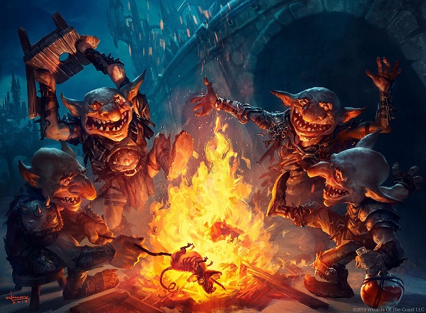
Everything goblin-related has been done over the game's twenty-five year history, yet ever so often, an artist pushes into something new.
When I saw that skewered rat being cooked and its insides translucent like a Chris Rahn dragon wing, I knew something was different here. For future reference, artists loved this piece because of its value control.
Value control refers to the darkest darks and lightest lights and how they force your eye to focus. Donato Giancola talked about it on Muddy Colors and I'll show you below why. If we remove the colors, you can start to see:
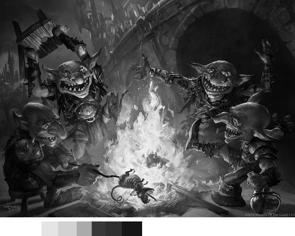
You can see the darkest darks underneath the bridge, with the lightest light in the fire. That's obvious with only shades. Add back in color and:
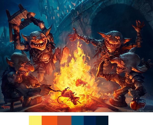
From yellow and oranges to blues and the mixture that gives us warm browns and a turquoise, palettes like this are difficult. It's much easier to just use all reds for goblins and call it a day. Svetlin went above and beyond and his effort should be called out as stellar.
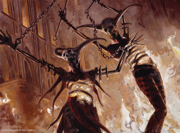
I love Dead Revels. It feels so rough, so gritty.
You can't tell if these are zombies celebrating, or being tortured, or even if this is real and not a propaganda piece for Rakdos to show their jubilant nature. Palumbo's thick brushstrokes are visible even at card size and I urge any "all Magic art looks the same people," to see this art. It's a common, so they may miss it when building their Arena decks. They should slow down and see this art for that it is-fantastic.

There are days where you think, today is the day.
Today is the day that Howard has peaked, age has set in, and he will rest.
You may think that often.
You are always wrong.
He just cannot be stopped, day after day, week after week.
Watch this video and at least three times you will assume he has an area done, only to go back and bring that 9.5 to an 11. He even caught me. The man doesn't need to go this hard on a dryad, non-legendary, in a middle set. And yet he do.
This piece made waves so I had to ask Sid about it:
The four of the five pieces I received were Gruul, so I was looking at the set entirely through that lens. They're a bunch of punk anarchists with a hint of social Darwinism, and the theme across all four cards was something beautiful and stable being torn down- spoilage. I had the idea to evoke rotting meat in the color schemes for the cards.
The Rakdos Drill Bit card had kind of the same thing going on-something nice turned horrible. The circus setting let me push the color so I could get the fun, flashy first read, but use the hands, costumes and searing red to evoke Hell behind it. I looked at some Leyendecker for Drill Bit because he's one of the only people I know of who could pull together that kind of crazy lighting and color without the whole thing becoming chaos. For anything unsettling like the Gruul, I'm always looking at Beksinski, although the cards don't look like it.
If you don't follow him on Twitter, he makes tweets on a long string of old masters he enjoys and influence his work. Leyendecker was at #40 and he's at #107 at the time of this article. Those digital or traditional thick brushstrokes he does that aren't quite transparent? You can see where he learned it from.
Add in some dynamic movement to Drill Bit, a perfectly named and flavor texted piece, and you have a knockout new card made for any Rakdos build.
J.C. Leyendecker. 40/? pic.twitter.com/5oRbca4SLd
— Sidharth Chaturvedi (@schaturvedi) November 15, 2018

I asked a Gruul card-carrying guild member in John Dale Beety, what he thought: "It's a statement painting by one of Magic's most underrated illustrators. It's a legendary creature who's also a Dungeons & Dragons crossover. This is as Gruul as it gets."
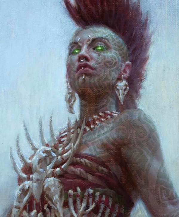
The sheer amount of detail alone is worth noting in this piece. The longer you look, the more you see. Pancoast's bones are all anatomically correct because fellow artist Lars Grant-West obviously loans him whatever he needs and they both live in Rhode Island.
The facial tattoos are soft, almost watercolor feeling, allowing you to still see texture on the canvas. It's not a piece for everyone, but the technical quality alone is astounding.
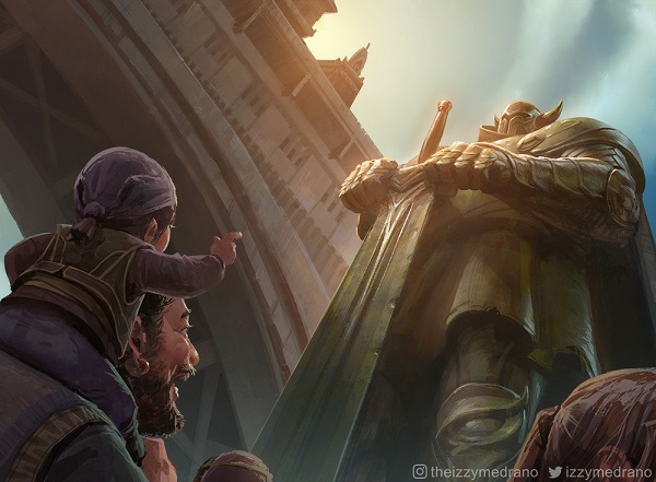
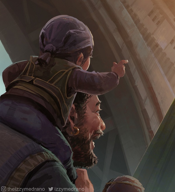
How great is the father and son exploring the city to see the Gate Colossus? This bit of familial joy is in a game about two wizards battling each other in a dystopian Ravnica on the brink of war. This is the calm of the set, an art direction element that every set should have.
This is Shivam Bhatt.
A happy father taking his child around the city, pointing out fun stuff, just having a day.
I have to end on my favorite art of the entire set, which has been asked to be made into a playmat already. It's the "teacup" art of the set. The quiet piece amid the noise of performance, of battle and destroyed altars by Gruul members. Jeremy Jarvis always believed in the quiet piece. Peace of Mind or Mother of Runes is what you should think of when creating a set, always have a card art that slows people down. It doesn't need to be happy, and it's often contemplative or sad. It balances the jubilation of Rakdos and slows us down to their everyday existence, masterfully done by Randy Vargas.
One of my favourite arts from RNA is definitely Bedeck so far. Seeing characters acting "normally" is often the strongest thing for world building also Judith doing her makeup via fireball light is pretty lit. Big up @VargasNi pic.twitter.com/Qjl4z2xreP
— Connagh Hawkins (@coL_Merchant) February 2, 2019
-Mike